Archive for the ‘Website’ Category
Daily Post – v3.0 is coming!
Filed under: Daily Post, Update, Website | Tags: Daily Post, Update, Website
 Leave a comment
It's coming
That’s right, brianhansondesign.com v3.0 is coming. After recently signing up for Google Analytics I have found that the bounce rate on my website is pretty high. Also, my page views are very low. Basically what that means is, people are finding my site, taking one look at my home page, and gettin’ the hell out of Dodge. I’m not sure if a simple redesign of the home page will get the bounce rate down and the page views up, but I want to go beyond that anyway. I’ve never been completely thrilled with where my social links are, and I have more to add now too. Plus, I think I need to do away with the Weekly Sketch session and try to figure out something a bit more relevant to a potential customer. Now, I’m hoping that in the next few days I may get some side work, which would obviously put a redesign on temporary hold, but I wanted to let you know that it’s coming. Get ready for sketches, screenshots, thumbnails, and mock-ups coming over the next few months.
Daily Post – Golf logo entry
I will be posting a version with color soon
Today I took one of my sketches from yesterday into Illustrator and worked it into a pretty nice logo. At least, I think it’s a pretty nice logo. I’m really hoping to get some feedback from the contest holders. This competition still has almost 5 days remaining and I really think with some good feedback about what is good and bad about this logo I have a real shot of winning. There is already some stiff competition for this contest, but I would honestly put my logo in the top half of what’s been submitted to this point. Let me know what you think. Do you think this logo works? Is it “edgy, yet subtle” like the contest holders asked for?What colors do you think will work best for this logo?
Daily Post – Golf company logo sketches

I found a logo design contest today on 99designs that I think is right up my alley. It is for a new golf tchotchke company that is trying to change the character of the game of golf. As much as I love golf, I do believe that at times it can be too stuffy and stoic, so to find a company that is looking to change that, and to have a chance to design their logo for them, I think is great. You can see the name of the company in my sketches. I’m obviously not taking the obvious route with my logo designs, I’m trying to think a little bit differently about what the name means and how it can be portrayed in a logo. Let me know what you think. Do any of these concepts work? Should I keep going with all of them? None of them?
Daily Post – Character Sketches
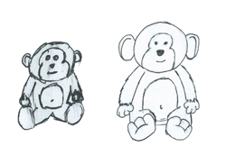
The one on the right is closer to what's in my head, but still not 100% there
These are just a couple of very rough sketches of a stuffed monkey that I want to incorporate into a children’s book. My sister has been bugging me for years to write a children’s book that my brother-in-law can illustrate. Well, I figure that maybe if I start sketching out the characters it will give me some motivation to write their story. That’s the hardest part for me, finding the discipline to sit down and write out the ideas that I have in my head. Hopefully, by working on perfect the character sheets for the book I can push myself to do it. That’s the plan anyway.
You can check out the second stage sketches I have of two of the other characters here.
Daily Post – Contest update and new designs
Filed under: 99designs, Daily Post, News, Update, Website | Tags: 99designs, Daily Post, Update, Website
Leave a comment 
I like my chances with the Entropia logo
So, my Big Richard logo design lost. They haven’t selected a winner yet, but my entry has been eliminated. I have to say, of all the contests I’ve entered so far, this is the one I for which I am most curious to see the winner. There were so many raunchy designs in the competition it’ll be interesting to see what the final winning logo is. In other contest news, I entered three more logo design contests today. I’ve already lost one (the three HealthySoil logos in today’s image) one is complete and I am still in the running (caricole) and the third (Entropia Digital) still has a little over two days left. I think these contests are helping me with my logo designs, but I’m not sure. I still don’t feel as if I’m spending enough time on them and getting little to no feedback from the contest holders doesn’t help me in figuring out what I am doing wrong. I do feel as though I am getting better, though, so that’s what I’m going with for now.
In other news, I have updated my profile on 99designs and Styleapple and want to link to them here. Adding these extra sites to my repertoire (not the right word, but I’m brain-cramping on what is) is making me think I am going to have to do the social links on my website. Maybe I’ll do something in the footer with them. I’m not sure what to do. This makes me think that version 3.0 of Brian Hanson Design may be coming sooner than I originally expected. Stay tuned.
Daily Post – 99Designs Contest Entry

No bigger image available for this one
Well, I knew that I would slack off eventually with my idea to post something every weekday, I just didn’t think it would be so soon. Oops. Anyway, today’s post is actually an entry into a design contest at http://99designs.com. It’s for a company called Bag4U. They wanted a modern, web 2.o looking logo for their company. I’m not 100% comfortable creating designs in the web 2.0 vein, so I figured this would be good practice. Honestly, I’m not expecting this design to win, but I think that in 99Designs I have found a site that will give me good fodder for filling up my daily posts. Also, thanks to entering this design I figured out how to create a gradient transparency in Illustrator. Didn’t know how to do that before.
Daily Post – New logo ideas

Some logo ideas
So, over the last couple of days, I’ve been toying with some new logo ideas. It’s nothing I would implement right now, maybe when I go to version 3 of the website. I don’t really know. I like my current logo and I’m not really looking to change it any time soon, but I wanted to see if I could come up with something different than what I have now, but that I still like. Well, what I’ve come up with is different, but I’m not sure how much I like them. I’ll take a step back, look at them in a day or two, and see what I think then. Until then, let me know what you think of them.
The redesign is complete
You can now see the new and (hopefully) improved Brian Hanson Design. I’d like any and all feedback on the new look and feel of the site. I’ve found that designing for one’s self can be extremely difficult and having honest criticism from others is very useful. When I was trying to decide what kind of layout I wanted for the new site, what pieces I was going to display in the portfolio section, and everything else that goes along with a design, I realized that I have a hard time looking honestly at work that is for me. When designing for others I can see what’s working and what’s not, in what direction I can take a sketch, and when to just scrap an idea completely. For some reason, when designing for myself, that ability seems to fly out the window. Knowing that I have such a difficult time deciding what I like and what I don’t when designing for myself, I now realize that when I eventually start work on version 3.0, I need a clear, concise plan of attack. I basically have to treat myself as I would a client and work on my own site as if it were someone else’s. Until then, though, I would appreciate your opinions on the site and welcome any criticisms, praise, suggestions, and notification of any errors on the site. Thanks everyone.
I know it’s new, but I’m changing it anyway
Well, I know that Brian Hanson Design has not been around for very long, but that doesn’t matter. It’s getting a face-lift anyway. I find it very difficult to be content with designs I come up with for myself and my website is no exception to that rule. My color scheme will be remaining unchanged, but everything else will be different. The biggest change will be that Brian Hanson Design will no longer be a one-page portfolio. There will now be a home page, portfolio page, services page, and an about page. I currently have the home page and the portfolio page done and am working on the other two. I have changed the layout pretty drastically and I’ve also completely redone the thumbnails. They are much larger and, at the moment, do not have a roll-over state, which is something I don’t know if I am going to do or not. The changes are coming soon, hopefully before the end of the year. You can view some screenshots by clicking on the thumbnails below. Let me know what you think of them.

The new home page

New portfolio page
