Archive for January, 2010|Monthly archive page
Daily Post – Short rant
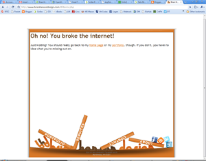
Yikes! You broke the internet.
I’m pretty busy today, but I wanted to post a quick rant explaining why I was unable to post anything yesterday. What happened was, I left work early due to not feeling well and figured I would have most of the day to find something to write about and get it posted. Just so happens that yesterday the internet broke in my hometown of Northwood, NH. According to our lovely service provider, Metrocast, the internet for the entire town is screwed up and they are working on fixing it. In the meantime, our internet access will be spotty at best and we probably won’t be able to get online. Well, isn’t that special? It drives me up a wall that I pay these people for a service and they can’t provide that service to me on a consistent basis. What would be their response to me saying, “I can only pay my bill sporadically for the time being. Some months you may get it, some months you may not.” I have a sneaking suspicion maybe that wouldn’t work too well. Anyway, enough complaining. I’m feeling better now and I should be able to get some new stuff posted up tomorrow. Thanks for reading my rant.
Daily Post – Quick note
Filed under: 99designs, Daily Post | Tags: 99designs, daily, Daily Post
 Leave a comment
 Today I entered the contest to design a logo for Webset Media and today, I lost that contest. I found it with only about 15 minutes remaining and whipped up two quick ideas, neither of which won. They were both decent designs, I think, but they needed a lot of tweaking that I just didn’t have time to do. I would have posted them here, but I am having trouble uploading images to my Blog account at the moment. Hopefully, I can either post them later today or put them in tomorrow’s blog. In other 99designs news, I lost the Cari Cole logo design contest from last week, but am still in the running for Entropia Digital. There is still over a week left for the people at Entropia to pick a winner, so I’m not sure when I’ll hear. As soon as I do, though, I’ll post the results.
Daily Post – Contest update and new designs
Filed under: 99designs, Daily Post, News, Update, Website | Tags: 99designs, Daily Post, Update, Website
Leave a comment 
I like my chances with the Entropia logo
So, my Big Richard logo design lost. They haven’t selected a winner yet, but my entry has been eliminated. I have to say, of all the contests I’ve entered so far, this is the one I for which I am most curious to see the winner. There were so many raunchy designs in the competition it’ll be interesting to see what the final winning logo is. In other contest news, I entered three more logo design contests today. I’ve already lost one (the three HealthySoil logos in today’s image) one is complete and I am still in the running (caricole) and the third (Entropia Digital) still has a little over two days left. I think these contests are helping me with my logo designs, but I’m not sure. I still don’t feel as if I’m spending enough time on them and getting little to no feedback from the contest holders doesn’t help me in figuring out what I am doing wrong. I do feel as though I am getting better, though, so that’s what I’m going with for now.
In other news, I have updated my profile on 99designs and Styleapple and want to link to them here. Adding these extra sites to my repertoire (not the right word, but I’m brain-cramping on what is) is making me think I am going to have to do the social links on my website. Maybe I’ll do something in the footer with them. I’m not sure what to do. This makes me think that version 3.0 of Brian Hanson Design may be coming sooner than I originally expected. Stay tuned.
Daily Post – Missed this one
Filed under: 99designs, Daily Post | Tags: 99designs, daily, Daily Post
Leave a comment 
Get it? Richard? Dick?
For some reason, I missed posting this design contest entry the other day. It’s for a clothing company called Big Richard. They fancy themselves a “cheeky” company that will be using slogans suck as “All any woman wants is a Big Richard” and such. Many of the other designers for the contest were really taking the Big “Dick” joke a bit too literally for me. I decided that I wasn’t going to go that route, I was going to think a bit differently. So, I decided that I wanted to use a rooster, or cock, for my logo. That way, I’m obviously still sticking with the joke but not going so far as to have a logo that looks like this: B—–D. Seriously. There is only 7 hours left in the contest and my design is still alive, hopefully I’ll have some good news about it in the coming days.
Daily Post – Contest update plus a new contest
Filed under: 99designs, Daily Post | Tags: 99designs, Daily Post
Leave a comment 
TweetPhoto logo contest entry
Well, the Narron & Holdford logo design contest is not officially over, but I am officially eliminated. Unfortunately, I never got any feedback from them, so I’m not sure why I was eliminated. Oh well. I’ve found these contests to really be fun and a great way to exercise some creative muscle. The one thing I wish, though, would be for more feedback from the people holding the contests. I understand that they get hundreds of entries and can’t give detailed feedback on every one, but even a quick, one sentence feedback would be helpful. Anyway, so long to Narron & Holdford, hello TweetPhoto. This is the latest contest I have entered. They want a modern logo that will give people the impression that they work hand in hand with many of the most popular social networking sites, which they do. I like my entry. I think the hint of the camera behind the text is cool, and I also think it has that Web 2.0 feel they were looking for. What do you think?
A New 99designs Entry (cont.)
Filed under: 99designs, Daily Post | Tags: 99designs, Daily Post
Leave a comment 
The bottom 3 have subtle differences with the ampersand
This contest has now completed over at 99designs, but I was able to enter these final four revisions. The contest holder has a week to declare a winner, so I guess I just have to wait. None of my designs were eliminated before the deadline, though, so I guess that’s a good thing. I think I like the second set of designs I did more. Of those three, I like the on with the ampersand behind the N but in front of the H the best. Hopefully the fine people at Narron & Holdford agree with me.
Daily Post – A New 99designs Entry
Filed under: 99designs, Daily Post | Tags: 99designs, Daily Post
Comments (2) 
A law firm logo entry
Today’s entry is for a law firm in North Carolina. The firm was looking for a logo that conveyed a professional, but modern image. My goal here was to use negative space to convey the image of the N and the H being combined. For a first attempt, I think it’s okay, but there are more places I can go with this logo that I think would be better. Unfortunately, there is only about 3 hours left in this contest, so I’m not sure I’ll have the time to improve this design the way I want. If I have time I think I want to try and incorporate the ampersand in my next attempt.
Daily Post – More 99designs Entries
Filed under: 99designs, Daily Post, Illustration | Tags: 99designs, Daily Post, Illustration
Comments (2) 
Entries for 99designs logo contests
So, I’ve been getting feedback from the contest holder for the Bag4U logo design contest at 99designs and you can see how the logos have evolved in today’s picture. Personally, I like the two in the middle row the best, but their last request for changes was to do more of a handbag and to use the colors, pink, white, black, and gray. Now they’ve responded asking for me to “punch up” the look of the bag a bit. They feel it’s too simple. The contest isn’t over for five days, so I have some time to get working on that. The last logo in the picture is for another contest for a company that calls itself Icon. The only requirements they had in their brief was to “free your mind and be creative” and to use red and white with dark grey being an acceptable secondary color. This contest only has about two hours remaining so I didn’t have a whole lot of time to be too creative. I do like the logo I came up with, but if I’m being totally honest, there are a few logos that were submitted that are much better than mine. We’ll see, I guess. I’m going to go check out some more contests and I’ll keep you posted on my entries.
Daily Post – 99Designs Contest Entry

No bigger image available for this one
Well, I knew that I would slack off eventually with my idea to post something every weekday, I just didn’t think it would be so soon. Oops. Anyway, today’s post is actually an entry into a design contest at http://99designs.com. It’s for a company called Bag4U. They wanted a modern, web 2.o looking logo for their company. I’m not 100% comfortable creating designs in the web 2.0 vein, so I figured this would be good practice. Honestly, I’m not expecting this design to win, but I think that in 99Designs I have found a site that will give me good fodder for filling up my daily posts. Also, thanks to entering this design I figured out how to create a gradient transparency in Illustrator. Didn’t know how to do that before.
Daily Post – New logo ideas

Some logo ideas
So, over the last couple of days, I’ve been toying with some new logo ideas. It’s nothing I would implement right now, maybe when I go to version 3 of the website. I don’t really know. I like my current logo and I’m not really looking to change it any time soon, but I wanted to see if I could come up with something different than what I have now, but that I still like. Well, what I’ve come up with is different, but I’m not sure how much I like them. I’ll take a step back, look at them in a day or two, and see what I think then. Until then, let me know what you think of them.
