Archive for the ‘Daily Post’ Tag
Daily Post – v3.0 is coming!
Filed under: Daily Post, Update, Website | Tags: Daily Post, Update, Website
 Leave a comment
It's coming
That’s right, brianhansondesign.com v3.0 is coming. After recently signing up for Google Analytics I have found that the bounce rate on my website is pretty high. Also, my page views are very low. Basically what that means is, people are finding my site, taking one look at my home page, and gettin’ the hell out of Dodge. I’m not sure if a simple redesign of the home page will get the bounce rate down and the page views up, but I want to go beyond that anyway. I’ve never been completely thrilled with where my social links are, and I have more to add now too. Plus, I think I need to do away with the Weekly Sketch session and try to figure out something a bit more relevant to a potential customer. Now, I’m hoping that in the next few days I may get some side work, which would obviously put a redesign on temporary hold, but I wanted to let you know that it’s coming. Get ready for sketches, screenshots, thumbnails, and mock-ups coming over the next few months.
Daily Post – Business cards
Filed under: Daily Post, News, Update | Tags: Daily Post, News, Update
Leave a comment 
Now I feel like I'm really in business
This weekend I finally received my first batch of business cards. I ordered them from VistaPrint about a week ago and, I have to say, I was very pleased with the way they came out. Especially considering that they were free. That’s a great thing about VistaPrint, they are constantly running deals where they give stuff away for free. All I paid for was the shipping.
I kept the design fairly simple for this first batch. At the moment, I just wanted something that I can hand out to people that lets them know what I do and has all of my information on it. Eventually, I am going to work my way towards a more elaborate card, but for now, this design works fine. If I do run out of these soon (although I think 250 cards should last me a while) I will order the glossy finish as opposed to the matte finish. The matte kept the cost at $0, but I think it’ll be worth the upgrade to get the glossy next time.
Daily Post – Discussion – Are design contests spec work?
Filed under: Daily Post, Discussion | Tags: Daily Post, Discussion
Leave a comment  As someone who checks out at least three different design forums daily I’ve read many opinions from people about design contests. Many designers feel that these contests cheapen our profession, that participating in these contests is tantamount to spec work, and believe me, designers hate the idea of spec work. Obviously, considering that I have entered multiple design competitions, I feel differently.
First, I would like to point out that I am against spec work. Doing a job for free for a friend or family member is one thing, building a website or designing a logo for someone simply to have work to add to your portfolio is something else entirely. As I’ve read someone else say, try asking a plumber or an electrician to do their work for free with the promise of giving them credit for their work when people ask. Chances are very good that you’ll end up sitting in the dark with a running toilet.
On the subject of design competitions however, I disagree with many of my colleagues. I relate it to a professional golfer. Are golfers giving away their work for free when they compete in a tournament? I don’t believe so, yet many of them don’t make the cut and therefore receive no money. I still don’t think this means they gave their work away. This is how I look at design competitions. Not only does it get your creative juices flowing, but you can also learn from them. You get to see the different ways other designers attack the same problem with which you’re faced and maybe you learn to look at things a bit differently.
What do you think? Are design competitions spec work or a respectable way for designers to hone their craft?
Daily Post – Short rant
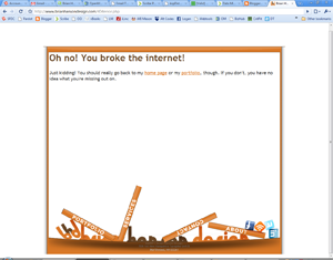
Yikes! You broke the internet.
I’m pretty busy today, but I wanted to post a quick rant explaining why I was unable to post anything yesterday. What happened was, I left work early due to not feeling well and figured I would have most of the day to find something to write about and get it posted. Just so happens that yesterday the internet broke in my hometown of Northwood, NH. According to our lovely service provider, Metrocast, the internet for the entire town is screwed up and they are working on fixing it. In the meantime, our internet access will be spotty at best and we probably won’t be able to get online. Well, isn’t that special? It drives me up a wall that I pay these people for a service and they can’t provide that service to me on a consistent basis. What would be their response to me saying, “I can only pay my bill sporadically for the time being. Some months you may get it, some months you may not.” I have a sneaking suspicion maybe that wouldn’t work too well. Anyway, enough complaining. I’m feeling better now and I should be able to get some new stuff posted up tomorrow. Thanks for reading my rant.
Daily Post – Quick note
Filed under: 99designs, Daily Post | Tags: 99designs, daily, Daily Post
Leave a comment Today I entered the contest to design a logo for Webset Media and today, I lost that contest. I found it with only about 15 minutes remaining and whipped up two quick ideas, neither of which won. They were both decent designs, I think, but they needed a lot of tweaking that I just didn’t have time to do. I would have posted them here, but I am having trouble uploading images to my Blog account at the moment. Hopefully, I can either post them later today or put them in tomorrow’s blog. In other 99designs news, I lost the Cari Cole logo design contest from last week, but am still in the running for Entropia Digital. There is still over a week left for the people at Entropia to pick a winner, so I’m not sure when I’ll hear. As soon as I do, though, I’ll post the results.
Daily Post – Contest update and new designs
Filed under: 99designs, Daily Post, News, Update, Website | Tags: 99designs, Daily Post, Update, Website
Leave a comment 
I like my chances with the Entropia logo
So, my Big Richard logo design lost. They haven’t selected a winner yet, but my entry has been eliminated. I have to say, of all the contests I’ve entered so far, this is the one I for which I am most curious to see the winner. There were so many raunchy designs in the competition it’ll be interesting to see what the final winning logo is. In other contest news, I entered three more logo design contests today. I’ve already lost one (the three HealthySoil logos in today’s image) one is complete and I am still in the running (caricole) and the third (Entropia Digital) still has a little over two days left. I think these contests are helping me with my logo designs, but I’m not sure. I still don’t feel as if I’m spending enough time on them and getting little to no feedback from the contest holders doesn’t help me in figuring out what I am doing wrong. I do feel as though I am getting better, though, so that’s what I’m going with for now.
In other news, I have updated my profile on 99designs and Styleapple and want to link to them here. Adding these extra sites to my repertoire (not the right word, but I’m brain-cramping on what is) is making me think I am going to have to do the social links on my website. Maybe I’ll do something in the footer with them. I’m not sure what to do. This makes me think that version 3.0 of Brian Hanson Design may be coming sooner than I originally expected. Stay tuned.
Daily Post – Missed this one
Filed under: 99designs, Daily Post | Tags: 99designs, daily, Daily Post
Leave a comment 
Get it? Richard? Dick?
For some reason, I missed posting this design contest entry the other day. It’s for a clothing company called Big Richard. They fancy themselves a “cheeky” company that will be using slogans suck as “All any woman wants is a Big Richard” and such. Many of the other designers for the contest were really taking the Big “Dick” joke a bit too literally for me. I decided that I wasn’t going to go that route, I was going to think a bit differently. So, I decided that I wanted to use a rooster, or cock, for my logo. That way, I’m obviously still sticking with the joke but not going so far as to have a logo that looks like this: B—–D. Seriously. There is only 7 hours left in the contest and my design is still alive, hopefully I’ll have some good news about it in the coming days.
Daily Post – Contest update plus a new contest
Filed under: 99designs, Daily Post | Tags: 99designs, Daily Post
Leave a comment 
TweetPhoto logo contest entry
Well, the Narron & Holdford logo design contest is not officially over, but I am officially eliminated. Unfortunately, I never got any feedback from them, so I’m not sure why I was eliminated. Oh well. I’ve found these contests to really be fun and a great way to exercise some creative muscle. The one thing I wish, though, would be for more feedback from the people holding the contests. I understand that they get hundreds of entries and can’t give detailed feedback on every one, but even a quick, one sentence feedback would be helpful. Anyway, so long to Narron & Holdford, hello TweetPhoto. This is the latest contest I have entered. They want a modern logo that will give people the impression that they work hand in hand with many of the most popular social networking sites, which they do. I like my entry. I think the hint of the camera behind the text is cool, and I also think it has that Web 2.0 feel they were looking for. What do you think?
A New 99designs Entry (cont.)
Filed under: 99designs, Daily Post | Tags: 99designs, Daily Post
Leave a comment 
The bottom 3 have subtle differences with the ampersand
This contest has now completed over at 99designs, but I was able to enter these final four revisions. The contest holder has a week to declare a winner, so I guess I just have to wait. None of my designs were eliminated before the deadline, though, so I guess that’s a good thing. I think I like the second set of designs I did more. Of those three, I like the on with the ampersand behind the N but in front of the H the best. Hopefully the fine people at Narron & Holdford agree with me.
Daily Post – A New 99designs Entry
Filed under: 99designs, Daily Post | Tags: 99designs, Daily Post
Comments (2) 
A law firm logo entry
Today’s entry is for a law firm in North Carolina. The firm was looking for a logo that conveyed a professional, but modern image. My goal here was to use negative space to convey the image of the N and the H being combined. For a first attempt, I think it’s okay, but there are more places I can go with this logo that I think would be better. Unfortunately, there is only about 3 hours left in this contest, so I’m not sure I’ll have the time to improve this design the way I want. If I have time I think I want to try and incorporate the ampersand in my next attempt.
